Responsive Website Design
Create layouts that automatically adapt to phones, tablets, laptops and large desktop displays.
- Flexible page layouts
- Responsive typography
- Adaptive images
- Flexible content sections
- Consistent branding
Create a faster, easier and more consistent experience across smartphones, tablets and desktops with responsive web design built for electronic and electrical component manufacturers, distributors and e-commerce websites.
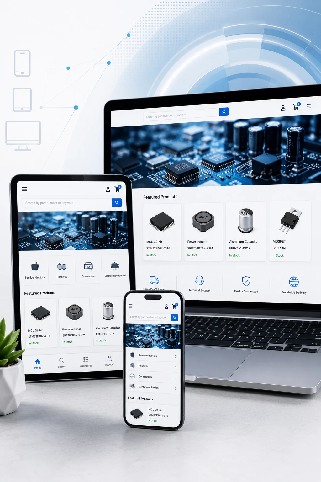
Engineers, buyers, purchasing teams and distributors increasingly access technical websites from a wide range of devices. A website that works well on a desktop but becomes difficult to navigate on a phone can create unnecessary friction during product research and purchasing.
DistyMan provides mobile and responsive web design for electronic and electrical component manufacturers and distributors, optimizing layouts, navigation, product search, specifications, forms and e-commerce workflows for phones, tablets, laptops and larger desktop displays.
Responsive design is more than shrinking a desktop page. Each element needs to remain readable, usable and efficient as screen size and input method change.
Create layouts that automatically adapt to phones, tablets, laptops and large desktop displays.
Optimize product discovery, account access and purchasing workflows for customers using mobile devices.
Make large technical catalogs easier to search and filter on smaller screens.
Present specifications, charts, tables and technical resources in formats that remain usable on mobile devices.
Design menus, buttons and controls for fingers instead of assuming a mouse and large desktop screen.
Test important pages and workflows across multiple screen sizes and browsers to identify responsive design problems before customers encounter them.
Electronic and electrical component websites can contain large catalogs, detailed specifications, customer-specific pricing and complex product-selection tools. These features need careful mobile design to remain practical on smaller screens.
DistyMan can optimize the full product journey from category navigation and technical search through product evaluation, RFQs and checkout.
Organize categories and product families so users can navigate efficiently on smaller screens.
Provide fast access to part-number, keyword and parametric product search.
Present specifications, documents, images and availability without overwhelming the screen.
Simplify RFQs, sample requests, cart actions and checkout for mobile customers.
Product pages frequently combine images, part numbers, specifications, inventory, pricing, technical documents and purchasing controls. Simply stacking every desktop element vertically can create excessively long and difficult mobile pages.
DistyMan can prioritize the most important information and reorganize secondary content into usable responsive sections, accordions and controls.
Parametric search is especially challenging on mobile because dozens of specifications and filter values cannot remain permanently visible beside the results as they often can on desktop.
DistyMan can redesign technical search interfaces around mobile-friendly drawers, expandable filters, selected-filter summaries and simplified controls.
Keep exact and partial part-number searching prominent and easy to access.
Organize voltage, current, package, temperature and other attributes for smaller screens.
Clearly show which criteria are currently limiting the product results.
Display enough technical information to compare products without creating clutter.
Large specification tables designed only for desktop often require horizontal scrolling or become unreadable on mobile. Responsive technical content should preserve accuracy while adapting the presentation to available space.
Reformat large specification tables into readable mobile-friendly structures.
Prioritize the attributes customers need when comparing related components.
Keep datasheets, drawings and certificates easy to locate and download.
Scale diagrams, charts and infographics without losing important detail.
Long forms can become especially difficult on mobile. DistyMan can simplify form layouts and field behavior to make technical requests and purchasing workflows easier to complete from smaller devices.
Keep quote requests clear and manageable without unnecessary fields or horizontal layouts.
Optimize customer, distributor and project registration workflows for touch input.
Make login, profile management and saved information easier to access on mobile.
Reduce unnecessary steps and keep purchasing controls visible and easy to complete.
Mobile users may be working with slower networks and less powerful devices, making page weight and front-end performance especially important. A responsive layout that loads unnecessary desktop resources can still create a poor mobile experience.
DistyMan can combine responsive design with caching, compression, optimized imagery, efficient code and CDN delivery to improve mobile performance.
Deliver appropriately sized product and marketing images for smaller displays.
Reduce unnecessary CSS and JavaScript that can delay rendering and interaction.
Reuse appropriate content and browser resources to reduce repeated downloads.
Improve loading, responsiveness and visual stability across important mobile pages.
Identify the pages, controls and technical content that create problems on smaller screens.
Develop layouts and interactions that adapt appropriately across device sizes.
Validate important workflows across phones, tablets, desktops and common browsers.
Improve usability and performance based on testing, analytics and customer behavior.
Search visibility depends on more than keywords. Mobile usability, page performance, content accessibility and technical quality all contribute to the overall experience customers and search engines encounter.
A responsive website helps maintain consistent content and URLs across devices while giving mobile visitors access to the same important technical information available on desktop.
DistyMan understands the unique challenges of mobile design for technical catalogs with specifications, parametric search, datasheets, customer pricing and e-commerce workflows.
Make technical product information, applications and distributor resources easier to access anywhere.
Optimize large catalogs, part-number searches, inventory and online purchasing for mobile customers.
Support accounts, customer pricing, RFQs, approvals and purchasing workflows across devices.
Create streamlined browsing and checkout experiences for customers shopping from phones and tablets.
We understand technical catalogs, specifications, datasheets and component-selection workflows.
Responsive layouts can be designed and implemented by the same team instead of handed between vendors.
Mobile design can be combined with Core Web Vitals, image and page-speed optimization.
We can optimize responsive search, pricing, accounts, RFQs, carts and checkout together.
DistyMan provides mobile and responsive web design for electronic and electrical component manufacturers and distributors, improving the way customers search, research and purchase products across phones, tablets and desktops.
Whether you need to modernize an older website or optimize a complex e-commerce platform, we can improve responsive layouts, technical content, navigation, search and conversion workflows.
Discuss Your Responsive Design ProjectResponsive web design allows website layouts and content to adapt automatically to different screen sizes, including phones, tablets and desktop computers.
Yes. Existing websites can often be redesigned or updated to improve responsive layouts, navigation, product pages, forms and mobile performance.
Yes. Filters can be reorganized into mobile-friendly drawers, expandable sections and compact controls while preserving technical search capabilities.
Yes. Specification data can be reformatted, prioritized or presented through responsive structures that remain readable on smaller screens.
Responsive design can support mobile usability, consistent content and overall page experience, all of which are important components of a technically strong website.
Yes. Cart, RFQ, account and checkout workflows can be reviewed and simplified to reduce unnecessary friction on phones and tablets.
Yes. Important layouts and workflows can be tested across a range of screen sizes and browsers to identify responsive design and compatibility issues.
Yes. DistyMan can combine responsive design with image optimization, caching, compression, Core Web Vitals improvements and other performance work.
Available on demand or under contract — decades of experience across web, print, content and AI. We specialize in websites for manufacturers and distributors.
24/5 support across the United States, India and Malaysia. Continuous monitoring and process improvement across all deployments.
Continual improvement under an ISO 9001:2015 process. Custom ERP, payments and workflow requirements are encouraged.
Award-winning design from concept through wireframes and production — tuned for industrial catalogs and conversion.
Product data, datasheets, SEO copy, PPC and campaigns so the site keeps working after launch.